5 Nov, 2025
How UX Microinteractions Improve Enterprise Dashboard Engagement

Have you ever opened the enterprise dashboard for your business and felt more overwhelmed than productive?
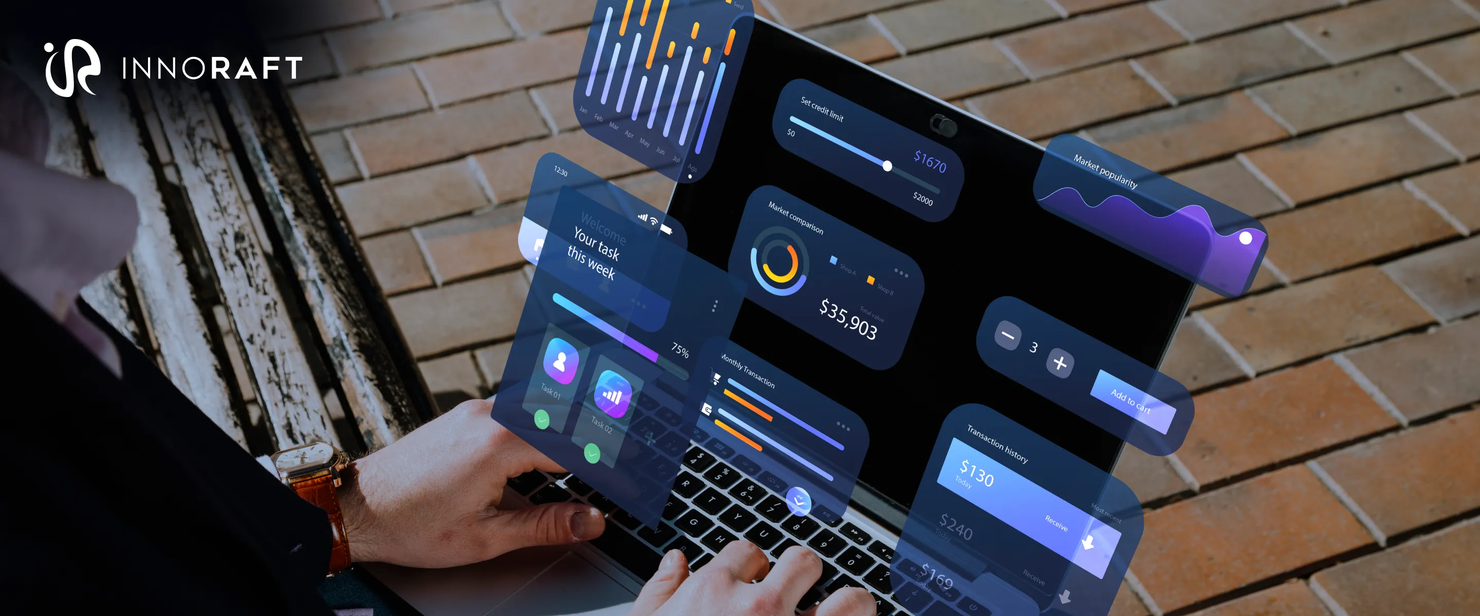
A typical enterprise dashboard is often a far cry from the general user-facing website, app, or dashboard. Enterprise dashboards often feature rows of metrics, competing colors (or no colors at all), and dense visual elements. These solid walls of information are designed with only efficiency in mind. Ironically, this singular focus on efficiency often ends up intimidating the very user it is meant to help, turning the efficient decision-making into a cumbersome task.
Enterprise users juggle multiple priorities. However, a dashboard designed without usability in mind can become a maze of charts and widgets that demand extra mental effort. This kind of cognitive load in a high-stakes environment can only burden the users, not make them more efficient.
This is where UX microinteractions in enterprise dashboards can quietly transform the experiences. These small, purposeful design moments guide attention, confirm actions, and turn overwhelming complexity into confident clarity. In an environment where every click and second counts, Microinteractions can make the difference between a user who understands and a user who abandons.
How do Enterprise Dashboard Microinteractions Boost Engagement?
In order to understand how you can boost user engagement with microinteractions for enterprise dashboards, you need to understand what engagement and microinteractions mean in the enterprise context.
What is Engagement in Enterprise Dashboards?
For any consumer-facing app, dashboard, or web design services, engagement means time spent in the app, likes, and shares. In an enterprise dashboard, however, engagement takes on a different meaning.
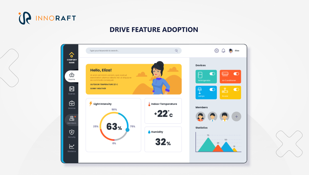
Engagement metrics on an enterprise dashboard are measured by how quickly and confidently a user can get an answer and complete a task. improving dashboard usability and having high engagement levels in an enterprise dashboard means:
- Utility and Efficiency: the user can find the specific data they need, filter it, and use it. They are not just looking at the dashboard, but rather using it to complete their tasks.
- Data Interaction: the user moves beyond passively viewing top-level charts and actively drills down to get more context and trusts the data enough to use its filters and advanced features.
- Confidence and Trust: the user feels confident that their actions are working, the data is fresh, and their inputs are correct. A lack of confidence leads to users abandoning the tool and exporting to Excel, which is the ultimate sign of a failed dashboard.
- Feature Adoption: the user discovers and uses the powerful but often hidden features of the dashboard, like creating a report, setting an alert, or sharing a specific view.
What are UX Microinteractions in Enterprise Dashboards?
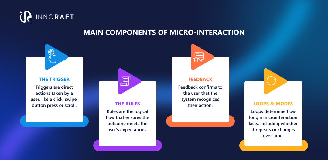
According to the Interaction Design Foundation, a microinteraction is a small, task-based interaction in digital products, which provides feedback or a visual response to user actions. By offering subtle hints and cues, these interactions guide users on how to use a product.
Think the rectangular apply button turning into a circle and displaying a checkmark when you click on the button, or the pretty heart animation when you 'like' a post on social media.
But when it comes to UX patterns for enterprise software, the role of microinteraction shifts. Its role is no longer to delight, but to provide confidence, clarity, and control.
For example:
- When completing a task in Asana, users are greeted with a celebration character like a unicorn, a phoenix, or an otter. This small example of microinteraction blends productivity and joy, which makes the users feel confident about their work.
- Upon clicking the final send button on an email campaign, the users are met with a celebratory high-five animation (featuring Mailchimp's mascot Freddie), reflecting their own sense of accomplishment.
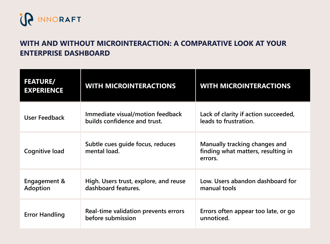
Microinteraction design principles act as the nudge that transforms a static, intimidating wall of charts into an interactive, responsive tool. They bridge the gap between the user and the data, enhancing user focus with design. Here are some examples-
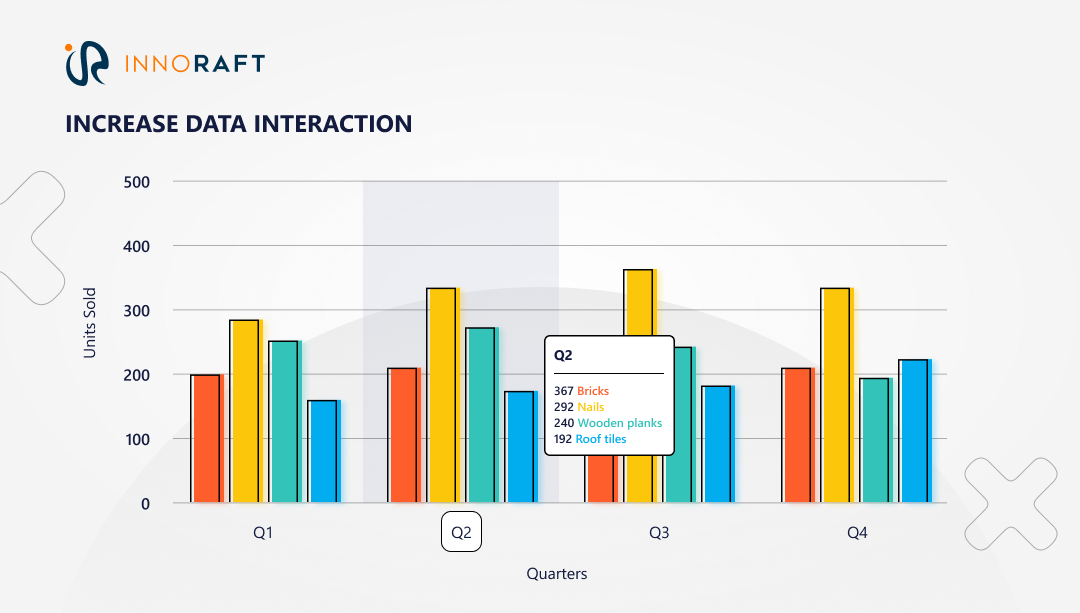
- Increase Data Interaction: A simple hover or tap on a chart can reveal deeper insights, highlight specific data points, or display tooltips that make complex numbers instantly understandable.
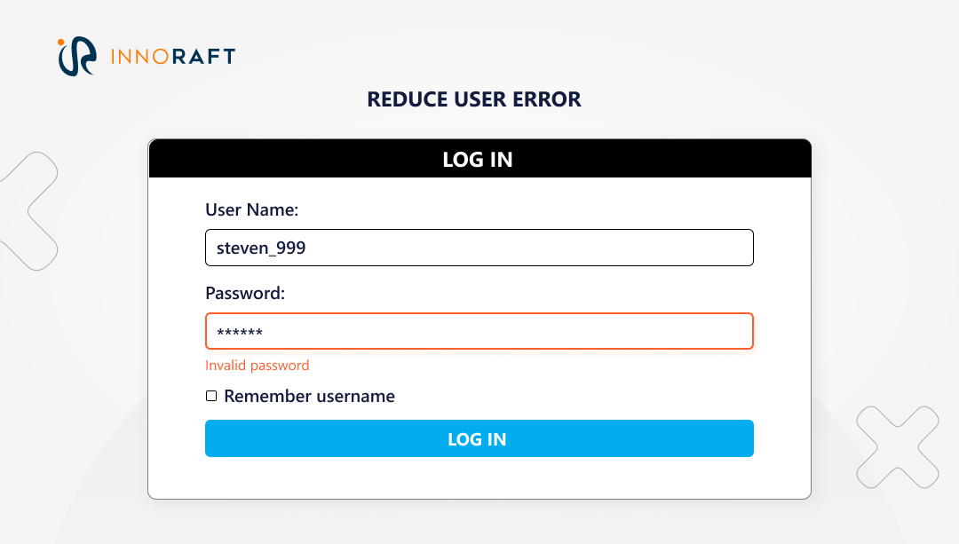
- Reduce User Error: When a user inputs invalid data, a quick shake animation or red highlight draws attention to the mistake before it causes frustration.
- Drive Feature Adoption: A small, pulsing cue near a new feature or dataset invites curiosity, subtly encouraging users to explore what’s new without intrusive pop-ups.
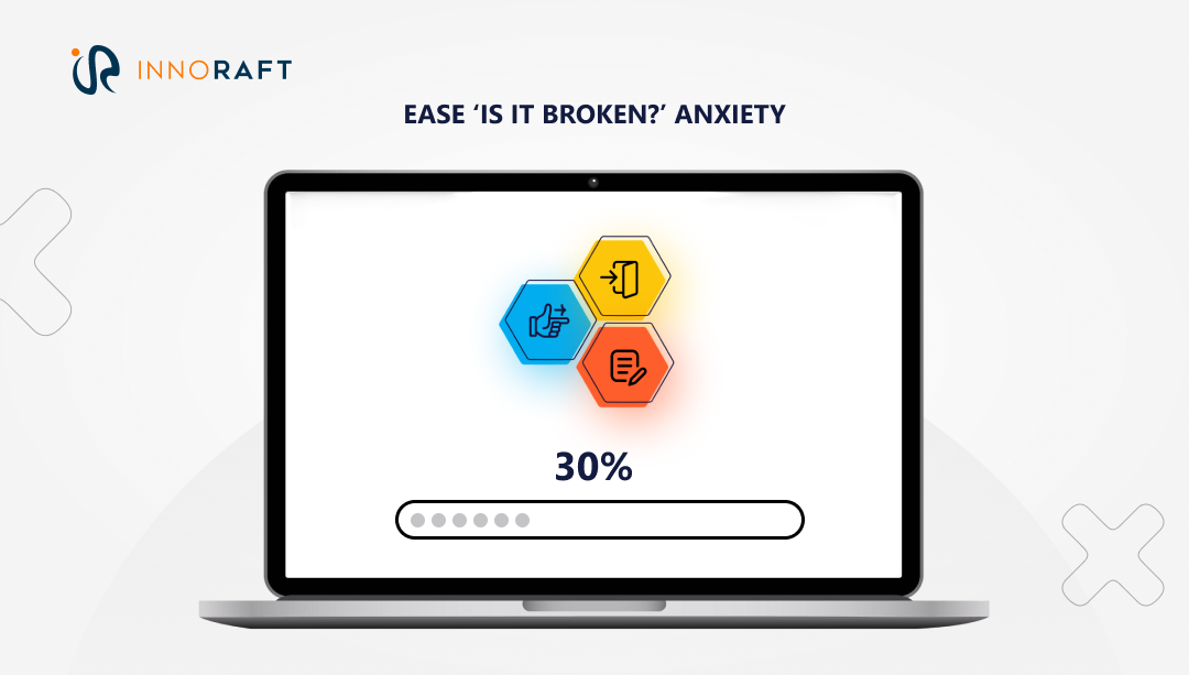
- Ease ‘Is It Broken?’ Anxiety: Visual reassurance like Figma’s loading animation or a progress bar with percentage, keeps users confident that the system is working as expected.
The Tangible ROI of Microinteractions for Enterprise Dashboards
Microinteractions are not just quirky animations; when done right, they can be part of your scalable UI design initiative, and have significant benefits. Here are some returns on investment you can expect from microinteractions for data visualization, error handling, or feature adoption on your enterprise dashboards.
Reduced Training and Support Costs:
Clear, immediate feedback with tooltips on hover, inline validations, and progress cues makes features self-explanatory. These UX patterns for enterprise software reduce questions relating to how tasks can be completed, and lowering onboarding time for new users. Well-scoped triggers and consistent feedback loops can minimize reliance on manuals and walkthroughs, especially in data-heavy dashboards where cognitive load is high.
Increased Productivity
Microinteraction features such as detail-on-demand and selection-linked control, ready mode switching, and cursor travel cut the time from question to answer on routine analysis tasks. These features not only help in improving dashboard usability, but further increase productivity with the help of skeleton loading and visible system status, as they preserve flow, allowing users to keep working instead of context switching during waits, improving perceived and actual throughput.
Lower Error Rates and Rework
Constraint-driven inputs and real-time validation prevent invalid queries and misformatted data before submission, reducing rework and downstream cleanup. By reducing cognitive load in dashboards, providing gentle, precise microcopy, and field-level motion, micro-interactions decrease dashboard abandonment and repeated mistakes, eliminating rework and error rates.
Higher User Adoption and License Renewal
Trust signals like last update timestamps, progress indicators, and consistent terminology increase confidence that the data is fresh and the system is responsive, boosting stickiness over time. The subtle time-bound nudges also drive discovery without disruption, improving feature uptake and perceived product value, all of which are key inputs for renewal decisions.
Teams that treat UX microinteractions in enterprise dashboards as operational levers, not decoration, see compounding gains: fewer support costs, faster analysis, cleaner data entry, and higher long-term product adoption.
When Should You Not Use Microinteractions?
Used carelessly, microinteractions can do more harm than good. But here are some enterprise dashboard design best practices to help you draw the line.
Prioritize Performance
A laggy animation is worse than no animation. In high-load dashboards like Power BI or Looker, keep animations lightweight and GPU-friendly. Reliability always trumps flourish.
Avoid Distraction
The data, not the motion, should command attention. Avoid decorative or repetitive effects that pull focus from metrics. In enterprise tools, clarity > personality.
Don’t Block User Control
Users should never wait for an animation to finish before interacting again. A “slide-in” that locks controls for two seconds might look polished but erodes usability.
Watch Out for “Cry-Wolf” Alerts
If everything flashes red, nothing is urgent. Reserve high-attention cues (like pulses or shakes) for truly critical events, system errors, data mismatches, or high-priority alerts.
Well-placed restraint is a hallmark of great enterprise design. Microinteractions succeed when they blend into the workflow, not dominate it.
Conclusion: The Big Impact of Small Design
UX microinteractions in enterprise dashboards aren’t simply finishing touches on a dashboard; they’re the functional glue holding it together. They reassure users that their inputs matter, their actions are recognized, and the system is working as intended.
In enterprise software, success often depends on how seamlessly humans and data interact. Microinteractions for data visualization, error handling, and trust building bridge that gap. They make dashboards feel responsive, reduce friction, and build confidence with every click.
Key Takeaways:
- Microinteractions transform overwhelming dashboards into intuitive, human-centered tools.
- They directly impact efficiency, accuracy, and trust considered to be core enterprise goals.
- The best microinteractions are invisible: they support data interpretation, not distract from it.
- In enterprise UX, polish isn’t decoration, it’s function.
The best design is the one that gets out of the way. Microinteraction design principles are the invisible threads that guide users through complexity, helping them turn information into action with confidence and clarity.
Want to know more about how to improve your business’s enterprise dashboards? Contact our experts today!
FAQ
Frequently Asked Questions
Didn’t find what you were looking for here?
