4 Nov, 2025
How Glassmorphism Drives User Focus In Complex Enterprise UI
User Interfaces (UI) are the digital storefront and operational core of any application, and in the enterprise world, their design is crucial for adoption and efficiency. Because UI revolves around aesthetics and design languages, it is constantly influenced by evolving trends and fashion.
Over the years, various UI trends have emerged, from Skeuomorphism to Neomorphism, and here we talk about Glassmorphism. For any passionate UI designer, particularly those focusing on large-scale enterprise UI design or offering web design services, keeping up with these shifts is essential.
Glassmorphism: The Transparent UI Design Trend
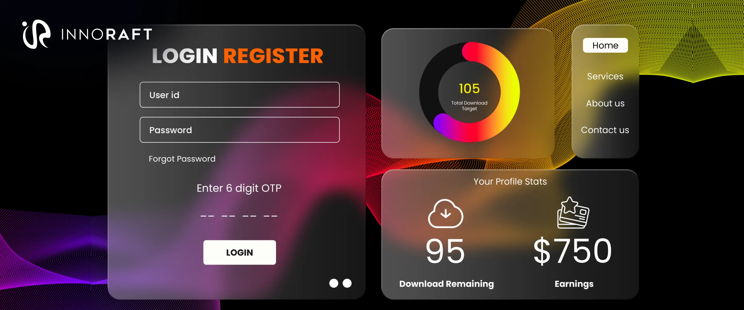
The glassmorphism design trend is a popular and elegant aesthetic characterized by interfaces that emulate the look and feel of frosted glass. This technique fundamentally adds dimensionality to designs, resulting in sophisticated and contemporary interfaces.
This aesthetic utilizes translucent surfaces, subtle shadows, background blur, and vibrant colors to create a layered interface. These layers not only contribute to a light and modern feel but, more importantly for enterprise applications, help establish a clear visual hierarchy. This is the essence of Transparent UI design.
Key Visual Characteristics in Glassmorphism
Glassmorphism creates a frosted glass effect with the following visual characteristics:
- Backdrop blur: Partially obscures the background, mimicking foggy glass.
- Transparency: Creates a see-through, softened appearance for layered elements.
- Depth and layering: Components appear to float above a colorful background, often enhanced with gradients, bright colors, and vivid hues for increased visual appeal and contrast.
- Soft borders and border highlights: Defines shapes with rounded corners, faint outlines, and subtle highlights.
- Minimalist approach: Embraces a clean aesthetic, typically paired with simple typography and icons.
Glassmorphism gained significant traction with its introduction in Apple's iOS 7 and further expansion in macOS Big Sur. Microsoft subsequently adopted this style within its Fluent Design System, contributing to its widespread adoption across various platforms.
In 2025, Apple further evolved glassmorphism with the launch of iOS 19, iPadOS 19, and macOS Sequoia. These updates introduced a new design system emphasizing depth, translucency, and layered effects, featuring enhanced glass-like surfaces, vibrant accent colors, and dynamic blur. Apple describes this refined aesthetic as a delightful and elegant experience.
Rather than moving away from previous trends, Apple leaned into glassmorphism, resulting in effects that feel more intentional and immersive across its applications and operating systems.
How Glassmorphism Improves User Experience?
Glassmorphism enhances usability and visual appeal by shaping user emotions and guiding attention. This powerful UX/UI synergy influences how users feel when interacting with a screen.
- Affecting User Emotions: The soft, frosted glass effect promotes a sense of calm. Smooth edges and a delicate blur aid user concentration. This contributes to creating aesthetic enterprise interfaces.
- Building Visual Hierarchy: Glassmorphism effectively organizes on-screen information. Transparent panels layered over colorful or blurred backgrounds distinguish essential content, such as pop-ups or alerts, from less critical elements. This layered approach adds depth, making it easier for users to prioritize where to look. This principle is vital for modern enterprise UX design.
- Directing User Attention: By blurring the background, glassmorphism makes foreground content stand out, allowing users to quickly find what they need. Semi-transparent layers create depth and a clear hierarchy, while frosted effects guide the eye without adding visual noise. This improved user interface transparency effect results in a clearer, more readable screen.
Implementing Glassmorphism Effectively in Enterprise UI
Glassmorphism, while visually striking, requires careful implementation to avoid overwhelming users and to maintain an engaging and appealing interface. Overuse can lead to a cluttered, unappealing design that quickly loses its modern charm.
Best Practices for Designers
- Strategic Placement: Reserve the frosted glass effect for specific elements like modal boxes or floating cards. This allows the background to subtly show through, making these elements appear sharper and more grounded. Avoid applying glassmorphism to lesser items such as buttons or plain divs, as it can detract from their function. When considering layout and readability, prioritize how design and background elements interact, as this affects depth, blur, and visual hierarchy.
- Maintain Visual Clarity: Pair glassmorphism with minimal typefaces and understated icons to keep the user's focus on essential content. Busy images or neon gradients can turn the calming effect of glass into visual noise. Clean layouts are always more compatible with semi-transparent layers.
- Prioritize Readability: Text readability is paramount. Low contrast can quickly diminish an artistic effect. Carefully measure the responsiveness between the blur and your text, then adjust the shadow or tint until the text is perfectly clear.
- Optimize for Performance: Be mindful that blur filters consume processing power. An animation that runs smoothly on high-end devices might stutter on older or budget-friendly phones. Benchmark your designs across various devices and keep the effect light to prevent user frustration.
- Consider Dark Mode: Translucent panels might glow rather than recede, and color schemes can shift unexpectedly. Thoroughly inspect every screen in both light and dark modes to ensure consistent visual appeal, as what looks dazzling in daylight may disappear at dusk.
Conclusion: The Future of Glassmorphism in UX
Glassmorphism represents a bigger trend towards immersive and layered interfaces. As augmented reality (AR), virtual reality (VR), and mixed-reality platforms continue to grow, the significance of transparency and depth will increase. Designers will likely enhance the techniques of blur and layering, particularly to improve accessibility.
As the glassmorphism design trend progresses, UX/UI design and design systems will evolve to incorporate these visual effects, thereby enriching depth, hierarchy, and overall user experience across various digital platforms. This establishes Glassmorphism as a key part of enterprise app design trends.
Innoraft provides web development services that specialize in building high-performance, and aesthetically brilliant enterprise solutions. Contact us today to transform your complex system into a sleek, efficient, and modern user experience.
FAQ
Frequently Asked Questions
The core modern UI design principles of Glassmorphism include:
1. Frosted glass appearance (via background blur).
2. A multi-layered structure to establish hierarchy.
3. Vivid, bold color backgrounds to emphasize the blur.
4. Subtle drop shadows and light, thin borders.
Didn’t find what you were looking for here?