30 Jun, 2025
Mastering Atomic Design in SDC: A Hands-On Guide

As frontend projects grow more complex, so do the challenges you face. You're building for more users, more devices, and more screen sizes than ever before. And as your code base scales, old processes start to show their cracks. Traditional monolithic development approaches often lead to duplicated code, inconsistent interfaces, and fragile systems that become harder to maintain with every sprint.
So, how do you build interfaces that are both scalable and sustainable?
The answer doesn't lie in simply rearranging folders or renaming files. What you really need is a unified architectural approach—one that prioritizes clarity, consistency, and purpose in your component system.
In this guide, we'll introduce a blueprint that combines two powerful ideas: Atomic Design methodology for frontend and Single Directory Components (SDC). Atomic Design gives you the mental model to break down your UI into a logical hierarchy - atoms, molecules, organisms, and beyond. SDC, on the other hand, brings a physical structure to that system by placing every part of a component - its logic, style, template, and tests - within a single self-contained directory. Together, they offer more than just a naming convention or a directory structure - they provide a strategic foundation for building resilient, reusable, and maintainable user interfaces. By bringing these two concepts together, you don't just organize your code - you create an ecosystem that supports discoverability, promotes consistency, and scales naturally with your team and your product.
In the following sections, we'll explore exactly how Atomic Design and Single Directory Components in Drupal complement each other and how adopting both can transform the way your team designs, builds and maintains front-end applications.
Establishing A Smart Foundation for Smarter Interfaces
If you've ever found yourself navigating a tangled web of components, disconnected files, or inconsistent patterns when building UI components in Drupal 10, you're not alone. As digital products scale, it's easy for frontend architecture to become fragmented and unwieldy. The solution - You need more than just a better folder structure. You need a solid architectural foundation.
At the heart of modern, scalable component systems are two key concepts: Atomic Design and Single Directory Components. Individually, each helps tackle core challenges in interface development. But together, they lay the foundation for a UI architecture that's logical, maintainable, and future-ready. Let's explore how these ideas work and why combining them can reshape how your team builds.
Deconstructing The Mental Model of Atomic Design
Atomic design is not simply a checklist but a powerful mental model. Introduced by Brad Frost, it gives teams a shared language for thinking about interfaces as both complete experiences and modular pieces.
Rather than approaching UI development as one big deliverable, Atomic Design in Drupal encourages you to build from the ground up - starting with the smallest parts and assembling them into complex, reusable systems. Inspired by chemistry, it introduces five levels of hierarchy:
Atoms
Atoms are your smallest building blocks - basic HTML elements and design tokens like labels, inputs, buttons, icons, colors, or typography settings. They're foundational, and while not always usable on their own, they offer essential structure and consistency. Think of them as the raw ingredients of your design system.
Molecules
Combine a few atoms, and you get molecules - simple UI elements that serve a clear functional purpose. A search form with a label, input field, and submit button is a perfect example. Molecules are meant to be portable, reusable, and focused, aligning with the single-responsibility principle.
Organisms
Organisms are more complex components made up of multiple molecules and atoms. These represent meaningful sections of a UI - like a website header that includes a logo, navigation menu, and search bar. They offer valuable context and can be used throughout your product.
Templates
At this level, you start assembling organisms into structured page layouts. Templates define how components fit together, giving stakeholders and developers a clear blueprint - without the distractions or final content. It's where the design structure meets layout logic.
Pages
Pages bring everything to life. Here, templates are filled with actual content, allowing teams to validate how well the system holds up in real-world use. If something breaks down at this level, it often reveals deeper issues in your molecules and atoms, making it easier to troubleshoot and iterate.
Despite the well-defined hierarchy, Atomic Design is not only about maintaining the levels. It is about creating consistency, reusability, and scalability. It fosters a shared vocabulary that helps designers and developers communicate clearly and align more easily to build reusable UI components in Drupal. And with a component structure that encourages reuse, your team spends less time reinventing and more time refining.
Understanding The Real-World Power of Single Directory Components (SDC)
While Atomic Design helps you think about what your components are and how they relate, Single Directory Components in Drupal define where they live and how they work.
The principle is simple but transformative. With SDC, everything a component needs - Its markup, logic, styling, and metadata - lives in one dedicated folder. Whether it's a .twig, .jsx, .css, .yml, or .js file, it all stays together.
The SDC approach eliminates the old, scattered method of separating files by type, think /templates, /css, and /js folders. Instead of hunting across directories, you go straight to the source. Need to update a component? Everything's right there. Need to delete it? You can do so without having to worry about stray dependencies lurking elsewhere.
Single Directory Components in Drupal significantly lowers the mental overhead for developers and makes components more discoverable, self-contained, and easier to manage across teams.
The benefits of SDC aren’t theoretical; they’ve already been embraced by major Drupal development services. It was introduced as an experimental module in Drupal 10.1 and now has become a more stable feature. Each component has its own .component.yml file, defining metadata, props, and slots. When you render a component, Drupal design system architecture automatically wires up its styles and scripts, removing the need for manual asset management. This shift is a strategic response to how teams are actually building frontends today. As component-driven development became the norm, the need for a modern, scalable system became unavoidable.
Why These Two Pillars Work Best Together?
Atomic Design in Drupal gives you the mental framework to define and relate your components. SDC gives you the physical framework to store, maintain, and scale them. Together, they align logic with structure - the 'what' with the 'where'.
This synergy creates more than a maintainable frontend- it builds a system that's intuitive for teams, easy to onboard, and ready for whatever comes next.
In the next section, we'll dig into how combining Atomic Design with SDC helps create a future-ready Drupal frontend architecture that leads to consistency, collaboration, and sustainable growth for frontend development.
A Strategic Blueprint for Integrating Atomic Design with SDC
Once we've understood the 'what' and the 'why' behind Atomic Design and Single Directory Component (SDC), the next question becomes inevitable: how do you actually start integrating Atomic Design with SDC in a real-world project?
This section walks you through the guided steps to cover how to organize your folder structure, apply consistent classification rules, and implement the pattern across different frameworks, including a detailed look at how this works in Drupal's SDC model.
Structuring Your System: Building a Scalable Component Library
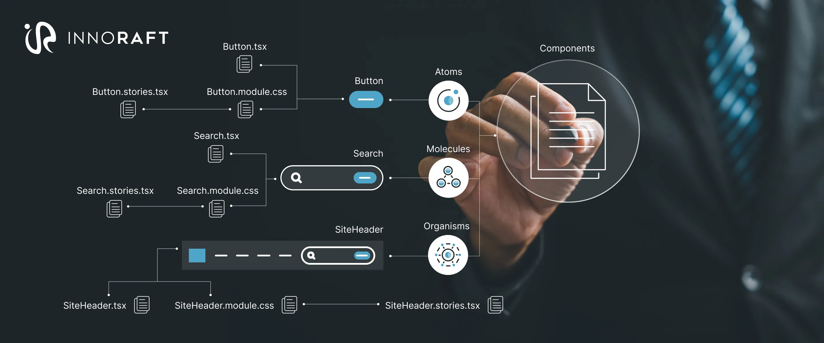
The first step in operationalizing a unified design system is laying down a folder structure that reflects your logic. The file system needs to mirror your mental model - clear, predictable, and future-proof. Here's what that looks like in action:
src/
└── components/
    ├── atoms/
    │   └── Button/
    │       ├── Button.tsx
    │       ├── Button.module.css
    │       └── Button.stories.tsx
    ├── molecules/
    │   └── SearchForm/
    │       ├── SearchForm.tsx
    │       ├── SearchForm.module.css
    │       └── SearchForm.stories.tsx
    └── organisms/
        └── SiteHeader/
            ├── SiteHeader.tsx
            ├── SiteHeader.module.css
            └── SiteHeader.stories.tsx
Each atomic level - atoms, molecules, organisms, is a folder; inside, every component is self-contained, following the SDC pattern. You've got your logic, styles, and tests (or stories) all colocated. The two-tiered approach is not just tidy; it is scalable, team-friendly, and fully compatible with tools like Storybook and frameworks like React/Angular.
Defining the Strategy for Component Classification
Component classification in Atomic Design is often where things fall apart. There may be disagreements over whether something is a molecule or an organism. Without clear guidelines, you risk consistency and confusion across your team. To avoid this, you need a practical, engineering-focused rulebook, one that's easy to apply and hard to misinterpret.
Here's a simple, defensible framework to guide classification.
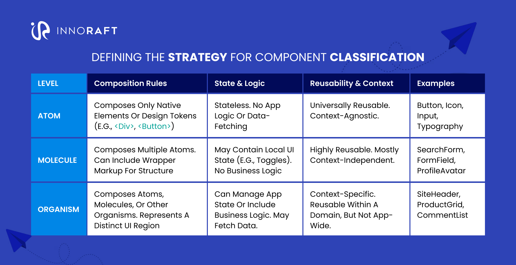
How to use it?
Ask the following questions-
- Does the component include other components? If the answer is no, it is an Atom.
- Does it include only Atoms and stay stateless? If the answer is yes, it's likely a Molecule.
- Does it include logic, app state, or domain-specific responsibility? If the answer is yes, it is an organism.
This framework gives your team a shared decision-making process and helps avoid classification conflicts.
Framework Blueprints: Adapting the Pattern to Your Stack
The strength of this unified theory lies in its flexibility. Whether you’re building with React, Twig, or another framework, integrating Atomic Design with SDC can be easily achieved with just a few adjustments.
Let’s walk through how it works in Drupal, a platform that's formally adopted SDC with built-in support.
Drupal 10.1 and above ships with official support for Single Directory Components, making it a natural fit for this architecture. Each component lives in its own folder and is defined by a .component.yml file—effectively its API contract.
my_theme/
└── components/
    ├── atoms/
    │   └── button/
    │       ├── button.component.yml
    │       ├── button.twig
    │       └── button.css
    └── molecules/
        └── search_form/
            ├── search_form.component.yml
            └── search_form.twig
Understanding component.yml:
This YAML file describes everything Drupal needs to know about your component:
- Name and description
- Props (structured data like labels or variants)
- Slots (areas for dynamic or nested content)
It works a lot like props and slots in modern JavaScript frameworks, which means developers coming from React or Vue will feel right at home.
Component Composition Example (Twig):
{# Inside search_form.twig #}
<div class="search-form">
  {# Input field here #}
  {{ include('my_theme:button', {
    label: 'Search',
    variant: 'primary'
  }) }}
</div>
Here, the molecule search_form includes the button atom using Twig’s include, and passes data using the with keyword—making the interaction clean, traceable, and testable.
Conclusion: Frontend development architecture for the future
The combination of Atomic Design and the Single Directory Components in Drupal is a strategic foundation for building scalable, modern user interfaces that grow with your team, your product, and your codebase. By merging a logical hierarchy (Atomic Design) with a physical organization system (SDC), this architecture solves some of front-end development’s most persistent challenges—complexity, inconsistency, and fragmentation.
The benefits of this unified system are real, measurable, and deeply interconnected:
- Scalability & Maintainability: Modular architecture means every component is self-contained. Want to add a feature? Just compose it from existing parts. Need to fix a bug? You know exactly where to look, with minimal risk of unintended side effects. As your design system grows, this predictability becomes priceless.
- Developer Velocity & Workflow Efficiency: Once your team has a robust library of atoms and molecules, you can build new features in hours—not days. Reusable UI components in Drupal reduce duplication, improve test coverage, and let your team focus on solving problems, not repeating work. This leads directly to faster iteration, quicker sprints, and higher throughput.
- Consistency & Cross-Team Collaboration: This architecture isn’t just for developers—it’s for everyone. By using using SDC with Atomic Design you can align designers, engineers, and product stakeholders around a shared set of components and language (e.g., “this is a molecule,” “this is a slot”), you eliminate ambiguity and build a single source of truth for your entire interface. That means fewer design handoff issues, fewer inconsistencies in implementation, and better UX overall.
Modern component architecture isn’t just about code—it’s about people, process, and long-term sustainability. This unified system gives your team the structure, vocabulary, and flexibility to build better, faster, and together. When implemented thoughtfully, this architectural approach becomes a durable foundation for a future-ready Drupal frontend architecture—something that doesn’t just work for today's sprint, but that continues to support innovation, iteration, and growth for years to come.
Want to know more about how to build a future ready foundation for your digital product? Connect with us.
