16 Jun, 2025
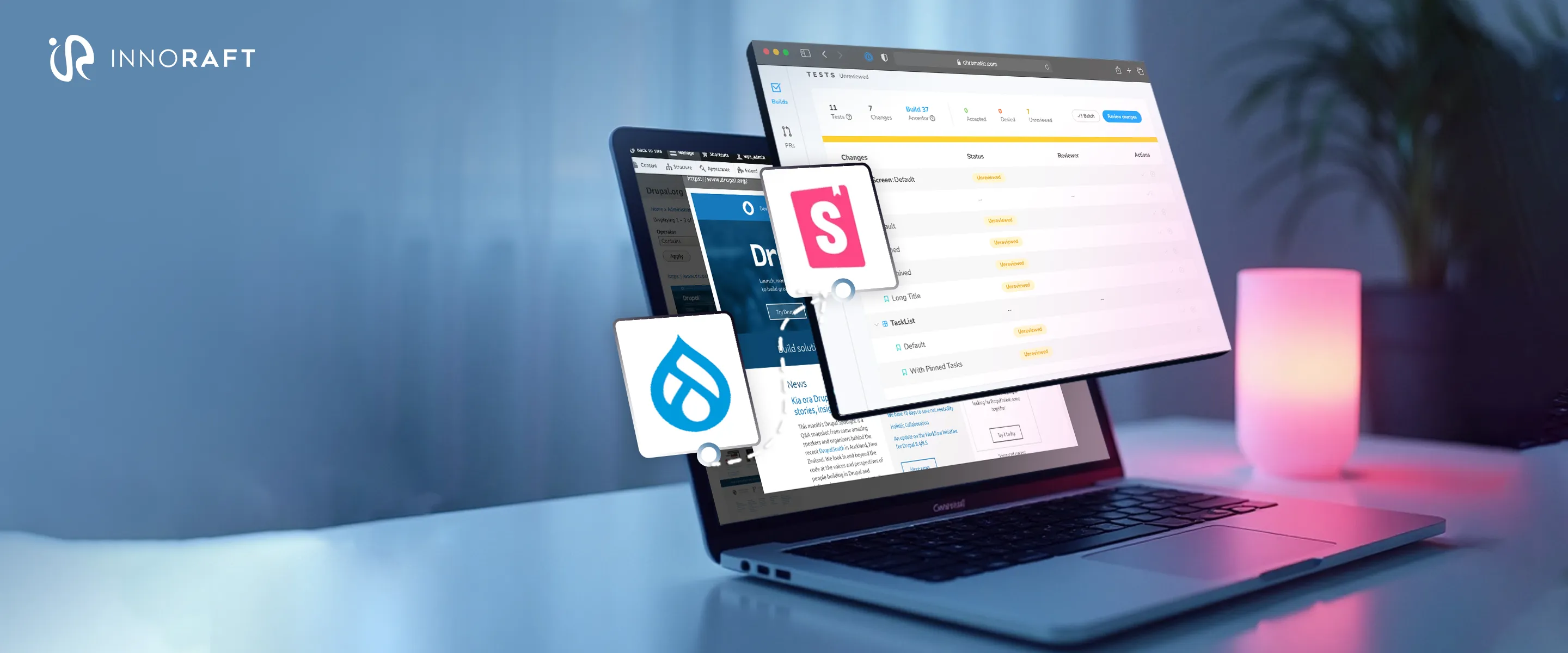
Integrating Storybook with Drupal SDC: A Complete Guide

The user interface (UI) development landscape is becoming increasingly complex, as modern users expect consistent, interactive experiences across various devices and platforms. This growing complexity poses significant challenges for the developers managing frontend development for large-scale digital products, leading to design inconsistencies and limited collaboration across teams.
To address these challenges, businesses are making a strategic shift towards more modular frontend architecture based on reusable components. A core principle of Component-driven development, the modular design approach is supposed to make UI development easier. While CDD has long been a staple for frameworks like React or Vue, it was notably absent in content management systems like Drupal. However, that changed when Drupal introduced the Single Directory components (SDC), allowing Drupal developers to adopt CDD principles for more efficient frontend development.
To further enhance the UI development workflow in Drupal, developers are now turning to complementary tools and methodologies, the most notable being Storybook. It is a powerful development environment that helps frontend developers to build, test, and document UI components in isolation. While Storybook and Drupal SDC simplify UI development, integrating Storybook with SDC can translate into even simpler UI development and other benefits. In the following points, we will examine these tools, the challenges and benefits of this integration, and the step-by-step process for Storybook integration with Drupal to build an easily scalable UI development system.
Understanding Storybook: The UI Component Workshop
Storybook is a well-known open-source front-end workshop environment for isolated UI development. Its core philosophy is to detach component development from the complexities and dependencies of the main applications. By rendering the components within an isolated environment, Storybook allows developers to focus intently on specific variations and states and handle edge cases without the interface of application-level business logic or context. This focused environment is instrumental in building robust UI elements.
Key Features and Benefits of Storybook
Storybook offers a rich set of features that translate into significant benefits for the UI development life cycle:
- Isolated Development & Stories: Isolated UI prototyping with Storybook using 'Stories'- declarative code snippets that capture the rendered state of the UI components.
- Interactive Component Directory: Acts as an interactive catalog of all UI components within a frontend component library and their states, removing the need to navigate a full app to inspect UI, thus speeding up development and reviews.
- Testing & Quality Assurance: Stories support robust testing strategies such as accessibility checks (via addons like axe-core), visual regression testing, and interaction testing, leading to more stable, testable UIs with fewer flaky tests.
- Documentation: Addons like autodocs generate live, code-driven documentation from component metadata, making Storybook a central source of truth for how UI components in a modular frontend architecture look and behave.
- Collaboration & Sharing: A published Storybook is a dynamic collaboration hub for teams and stakeholders, enabling feedback, sign-offs, and integration with tools like Figma and Notion.
- Extensible Addon Ecosystem: Supports powerful addons such as Chromatic (visual testing), MSW (API mocking), A11y (accessibility), and Storysource (view source code), enhancing development and QA workflows.
- Framework & Format Support: Compatible with React, Vue, Angular, and more, using the open Component Story Format (CSF) for broad toolchain interoperability and vendor neutrality.
The power of Storybook lies not just in viewing components, but in fostering a component-first development mindset. The effort invested in crafting well-defined stories for development directly translates into valuable assets for testing and documentation. This interconnectedness makes Storybook a comprehensive development environment and one of the best frontend collaboration tools. Furthermore, adopting the open Component Story Format (CSF) is a strategic advantage. It ensures that the investment in creating stories is not locked into a single ecosystem, allowing these portable assets to be leveraged by a growing array of compatible tools, thereby future-proofing development efforts.
Deep Dive into Drupal Single Directory Components (SDC)
Single Directory Components (SDC) represent a significant evolution in how UI components are now being structured and managed for better accessibility, streamlined workflow, separation of concern, compartmentalisation of UI elements, and collaboration between team members, particularly by expert Drupal development partners. Introduced as an experimental module in Drupal 10.1 and now a more stable feature, SDC offers a modern approach to Drupal component theming. The fundamental principle of SDC is the co-location of all assets required for a web component, such as YAML metadata, Twig templates for markup, CSS stylesheets, and JavaScript files, into one dedicated directory. This directory can also include optional assets like screenshots, images and icons. In the SDC paradigm, a "component" is a modular, reusable building block that fully encapsulates all the resources necessary to render a specific piece of the user interface.
Purpose and Advantages
The introduction of Single Directory Components (SDC) has significantly enhanced the development of Drupal UI components and the theming process through improved structure, modularity, and collaboration.
- Organization & Maintainability: SDC centralises all component-related files in a single directory, simplifying file management and improving code maintainability by eliminating the scattered asset structure of traditional theming, simplifying UI development workflow.
- Modularity & Reusability: SDC promotes self-contained, interchangeable components that help create reusable UI components in Drupal for different pages and applications, leading to more efficient UI development.
- Consistency: Encourages standardized patterns for component structure and behavior, ensuring visual and functional consistency across the site.
- Scalability: A modular frontend architecture makes extending or modifying the UI easier as projects grow, supporting long-term scalability.
- Testing & Debugging: Isolated components simplify testing and debugging by allowing issues to be identified and resolved at the component level.
- Collaboration: Drupal Single Directory Components provides a structured methodology for smoother collaboration between frontend and backend developers, designers, and other team members.
- Streamlined Theming: Integrates HTML, CSS, and JS into a single, reusable format, making Drupal component theming more efficient and developer-friendly.
- Automated Asset Loading: When the Twig template is rendered, a component's styles and scripts are automatically included, reducing manual dependency tracking.
- Tool Integration: SDCs' structured nature enables seamless integration with modern frontend tools, including Storybook, enhancing component development workflows.
SDC modernizes Drupal theme development with components by aligning it with component-based architectures prevalent in many JavaScript frameworks. This enhances the Drupal development experience and makes it more accessible to frontend developers familiar with these contemporary patterns. The "single directory" concept significantly reduces cognitive load; when all aspects of a component reside in one place, developers can more easily grasp its scope, dependencies, and the potential impact of modifications, leading to faster development cycles and a reduction in bugs.
Storybook Integration with Drupal SDC
While Drupal Single Directory Components lets you organize your UI components, Storybook enables you to interact with them without running the whole application. Integrating Storybook with SDC creates a powerful synergy, helping to visualize and test components in isolation independent of the working behavior of Drupal. While SDC provides a robust structure for organizing UI components, Storybook offers the ideal environment to develop, visualize, test, and document these components in isolation. Essentially, Storybook becomes the interactive workshop and visual proving ground for SDCs before they are woven into the fabric of a live Drupal application.
Why Integrate Storybook with Drupal SDC?
The combination of SDC with Storybook can unlock multiple key advantages.
- Isolated development for SDC: With this integration, you can develop and test components independently of the Drupal backend.
- Easy Component Integration: The component can be integrated seamlessly into the Drupal environment, and can be made interactive without the actual business logic or data.
- Simplified Testing: Storybook provides a dedicated environment for testing the functionality and appearance of individual components.
- Easier Collaboration: Storybook serves as a dedicated environment for testing the functionality and appearance of individual components.
- Stakeholder Accessibility: Storybook enhances stakeholder accessibility by providing an inclusive, interactive environment where all team members can explore, test, and validate UI components regardless of technical expertise.
- Enhanced Scalability and Adaptability: Utilizing tools like Faker.js and JSON Schema within Storybook promotes the creation of flexible and scalable components.
- Leveraging a widely used frontend tool: Storybook is a popular and well-supported in the broader frontend development ecosystem.
- Drupal-related functions within components: SDC allows for the addition of Drupal-specific logic directly within the components when necessary.
- Consistency and reusability: Developing components in isolation with Storybook promotes consistency in UI elements and encourages their reuse across the application.
- Leveraging Storybook's full potential: Integration unlocks the complete range of features and addons available within the Storybook ecosystem.
The integration usually involves configuring Storybook to discover and render SDCs. The Drupal Storybook module can further facilitate this by managing aspects like Drupal-specific markup requirements through decorators. The core idea is that Storybook loads SDC components, simplifying the creation and management of stories with minimal setup.
This integration effectively helps augment UI development in Drupal. Such decoupling is a hallmark of modern web development, bringing substantial efficiency gains and allowing for more parallel workflows. Furthermore, by leveraging Storybook's testing and visualization capabilities early in the SDC development process, Drupal projects can more effectively enforce Consistent UI/UX patterns and accessibility standards. Components are vetted in an isolated, focused environment before deployment, leading to higher quality, more consistent, and more accessible user experience on the final Drupal site.
Integrating Storybook with Drupal SDC
Storybook integration is great for UI development in Drupal as it provides a dedicated, interactive sandbox to build, test, and showcase your components without having to run the application, streamlining the whole process.
However significant the impact might be, it is still challenging to integrate Storybook with Component Driven Development in Drupal. It is not a straightforward process, as Drupal uses twig as its rendering engine which is basically a php based tool, while Storybook is a Node.js based application using js files. This fundamental difference introduces some interesting challenges that we need to overcome.
The Core Challenge: Bridging the Technology Gap
The main caveat of using Storybook for Drupal SDC lies in the fact that Storybook, a JavaScript-based application, needs to understand and render the Drupal components, which are primarily defined using Twig templates. Twig files are a templating language processed server-side by PHP within the Drupal environment. Making a client-side JavaScript application understand these server-side templates requires a translation layer.
The Strategic Implementation: A Step-By-Step Approach
There are multiple methods for Storybook integration with Drupal. Here, we will be discussing the integration process using Drupal Storybook Module. For the successful integration of Storybook with Drupal SDC, you can follow these key steps:
Installing the Storybook Drupal Module
The first step is to install the official Storybook module for Drupal. This module can provide essential configuration and potentially streamline some aspects of the setup.
Configure CORS to Address Cross-origin Issues
Since Storybook runs as a separate development server, likely on a different port than your Drupal instance, you'll encounter Cross-Origin Resource Sharing (CORS) restrictions. To allow Storybook to fetch and render the component stories, you must configure your Drupal development environment to enable cross-origin requests. This is commonly done by adjusting the development.services.yml file. While Storybook is not typically used in a production environment, in the rare cases that it is, more restrictive CORS policies are crucial for security in larger or production-like settings.
In development.service.yml of our Drupal setup, we need to set some CORS config like this:
parameters:
  # ...
  # Remember to disable development mode in production!
  storybook.development: true
  cors.config:
    enabled: true
    allowedHeaders: ['*']
    allowedMethods: ['*']
    allowedOrigins: ['*']
    exposedHeaders: false
    maxAge: false
    supportsCredentials: true
services:
  # ...
Also, It’ll be better to keep the twig cache and render cache disabled, along with keeping the debugging on for development purpose:
drush state:set twig_debug 1
drush state:set twig_cache_disable 1
drush state:set disable_rendered_output_cache_bins 1
Enable Twig Understanding with the Twig Loader
As mentioned in the challenges, Storybook is a Node. js-based tool, and Twig is a templating language written in PHP. To bridge this gap between Storybook and Twig templates, specially for supporting Twig component rendering, you need a Twig loader, such as Twig.js. This JavaScript library acts as a translator, taking the Twig files and transpiling them into their JavaScript equivalents. This allows the Storybook environment to understand the structure and content of the Drupal template.
Leveraging Twig Drupal Filters to Emulate Drupal Functionality
Drupal's Twig implementation often includes custom filters and functions that add specific Drupal-related logic to your templates. To ensure accurate rendering in Storybook, we need to emulate this functionality. The twig-drupal-filters NPM package can provide JavaScript implementations of many common Drupal Twig filters. By importing this package into your Storybook's preview.js file, you make these filters globally available to your components within the Storybook environment.
npm i --dev twig twig-drupal-filters twig-loaderDefining Your Component Stories
With the rendering pipeline in place, you can now start to define stories for your Drupal Single Directory Components. Typically, these stories are written in JavaScript files (often with a .stories.js extension) and can utilize formats like JSON. For a component like a CTA button, you need to:
- Create a default export: This defines your component's base configuration or default variant.
- Create named exports: These represent different variations or states of your component (e.g., primary CTA, secondary CTA, disabled CTA).
- Bind named exports: You can bind these named exports to the default export to ensure they inherit the base arguments and setup.
Ensure Anonymous Rendering of the Storybook Module
To allow Storybook to render components correctly within the module, it is essential to export the module anonymously. If the module is not provided anonymously, Storybook might fail to render the components or display stories due to conflicts with named modules or metadata expectations.
When integrating Storybook with a design system or shared component library, exporting the module anonymously ensures that components do not rely on specific module identifiers. This avoids potential issues with module resolution, especially in frameworks like Angular, where metadata and declarations are tightly coupled.
Run the Storybook Instance
Finally, you need to run the Storybook development server. This is typically done using an NPM script defined in your package.json file, often something like npm run storybook. Executing this command will launch a separate web application that provides a visual playground where you can interact with your Drupal components in isolation, explore their different states, and ensure they render correctly.
Before proceeding, it is essential to ensure that each SDC component has a properly defined and populated component.yml file. This metadata file plays a critical role in informing Storybook (and supporting tools like Twig loaders and Drupal filter emulators) on how to render the component correctly, providing key details such as default props, context, and documentation references. Without it, Storybook may not be able to correctly interpret or display the component, undermining the goal of a reliable and consistent development environment.
Though Storybook integration with Drupal requires navigating the differences between JavaScript and PHP, the benefits of a dedicated component development environment are significant. By leveraging tools like Twig loaders and Drupal filter emulators, we can easily bridge this gap and embrace a more component-driven approach to building Drupal websites. This creates a more maintainable, testable, and visually consistent user interface.
Conclusion
The Storybook integration with Drupal culminates in a development workflow that is significantly more mature, efficient, and maintainable. It empowers developers to build higher-quality user interfaces with increased speed and confidence. SDC brings essential structural organization to components, particularly within Drupal component-based architecture, by co-locating all relevant assets. Storybook then provides an unparalleled workshop environment, enabling developers to build, test, and document these SDCs in true isolation, fostering quality and accelerating iteration cycles. This integration ensures design decisions flow seamlessly from definition to implementation, visually validated at every step within Storybook, and structurally organized by SDC.
Ultimately, the adoption of SDC and Storybook reflects a shift towards more systematic, engineered approaches to UI construction, mirroring the rigor long applied to backend systems. The journey towards a flawless UI development workflow is continuous, but with such tools at their disposal, teams are better equipped than ever to meet and master the challenges of modern web development, delivering UIs that are not only functional but also consistent, maintainable, and delightful to use.


