13 Mar, 2026
How UX Strategy Drives Business Growth: Metrics, KPIs & Impact


We are going to cut right to the chase : "Design debt" is a silent drain on your product's potential. It doesn't instantly zero out your profit margins, but it acts as a hidden inefficiency. When usability compromises accumulate during development, they eventually slow product evolution, frustrate users, and inflate maintenance costs.
You need more than UI refresh to overcome this debt. You need to embrace a UX strategy that aligns user needs, product capabilities, and business goals- all three into a cohesive, long-term experience roadmap. In mature product organizations, UX ROI is treated as a growth discipline alongside product management and analytics.
UX strategy frameworks can be a high-yield growth engine. When your strategy is deeply integrated with product analytics, it stops being a subjective exercise and becomes a quantifiable lever. We are talking about converting behavioral data into sustainable revenue, enabling high-retention product experiences, and aggressively reducing the operational cost to serve.
The Foundation of Your UX strategy: Key Metrics to Track
Before you can even impact the bottom line, you must instrument your product to capture both behavioral realities (what users do) and attitudinal signals (how they feel). But, trying to organize all these signals for measuring UX success without a framework is usually a mess. That’s exactly why Google's HEART framework has become the default playbook for so many expert web design services. When your design, product, and analytics folks finally sit down together, these are the specific numbers they need to be staring at.
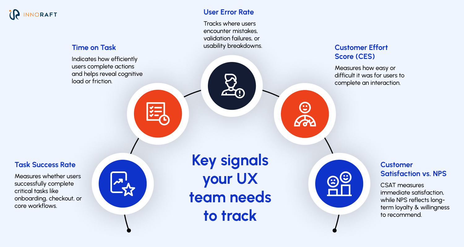
- Task Success Rate (Task Success): Did the user complete what they started? This is particularly powerful when measuring critical journeys like onboarding, checkout, or core workflows, and is one of the most important UX performance metrics. Calculate it as: (Successful Tasks / Total Attempts) x 100.
- Time on Task (Engagement): This measures cognitive load. However, it only matters when compared against a baseline (historical performance, competitor averages, or usability testing goals). For a B2B dashboard, faster is usually better. For a media app, a longer time on task indicates healthy engagement and is an important part of UX analytics.
- User Error Rate (Task Success / Usability): This is where you find your friction. In real-world product analytics, teams track form error rates, validation failures, and backtracking behavior as part of measuring UX success. High error rates demand immediate heuristic evaluations.
- Customer Effort Score (Retention Signal): “On a scale of 1-7, how much effort did you have to expend?” CES does not replace your retention metrics; it complements them. Retention is a behavioral metric; CES is an attitudinal leading indicator that diagnoses friction before the user actually churns and contributes to understanding UX impact on business.
- Customer Satisfaction vs. NPS (Happiness): It's vital to distinguish these. CSAT measures transactional satisfaction (e.g., "How was your support chat today?"). NPS (Net Promoter Score) measures long-term loyalty intention (e.g., "Would you recommend us to a colleague?") and is often used among metrics to measure UX success.
Additionally, along with these signals, your design team also needs to keep an eye on qualitative research as part of UX analytics. These above mentioned metrics reveal what is happening, but they rarely tell you why. To build a complete UX strategy, these metrics must be paired with qualitative research, like usability testing, contextual inquiry, and session replay analysis. Metrics reveal the patterns; research reveals the causes.
The Bridge: Connecting UX Metrics to Business KPIs
While designing for emotions is important for your UX strategy, executives rarely care about the cognitive load of a dropdown menu. They care about P&L and overarching North Star Metrics (like "Time to First Value" or "Weekly Active Teams"). Here is how you mathematically translate foundational UX signals into those executive-level financial outcomes, helping demonstrate UX ROI.
Task Success Rate & Time on Task → Operational Efficiency
If an internal enterprise tool has 1,000 users, and an improved UX reduces a daily workflow by 5 minutes per user, that’s 83 hours saved daily. While you must account for adoption curves, training, and workflow variability, the eventual result is a massive boost in payroll efficiency and faster time-to-market, demonstrating UX impact on business.
User Error Rate → Reduced Customer Support Costs
Grab the Cost Per Contact metric from your support team. Let’s say a confusing login flow triggers 5,000 password-reset tickets in a given month. At eight bucks a ticket, you aren't just annoying your users, you are literally spending $40,000 a month to subsidize a bad interface, highlighting the importance of UX optimization.
CES (Customer Effort Score) → Customer Retention & Lifetime Value (LTV)
Nobody sticks around if using your product feels like a chore. In fact, according to studies, 96% of people will actively pull away from a brand after a high-effort interaction. Why? Because low-effort experiences reduce cognitive load, frustration, and abandonment. By driving CES down, you organically raise your LTV and support UX driven growth.
Frictionless Conversion (UX) → Revenue Growth (KPI)
UX is a major lever within Conversion Rate Optimization (CRO), alongside pricing, messaging, and trust signals. Of course, UX cannot compensate for weak product-market fit, but within a validated product, interface friction often becomes the largest remaining barrier to conversion.Think about bumping your checkout completion rate from 2% to 2.5% just by clearing out the interface clutter. That tiny half-percent lift translates into a massive chunk of found revenue, entirely driven by better design and UX impact on business.
NPS → Brand Loyalty & Lower Acquisition Cost (CAC)
When your Net Promoter Score is high, your users start doing the selling for you. That kind of organic word-of-mouth means you aren't forced to buy every single new sign-up through expensive ad campaigns. As your reliance on paid channels shrinks, your Customer Acquisition Cost (CAC) naturally drops right along with it, leaving you with a much healthier profit margin per user and strengthening UX ROI.
How to Implement a Metrics-Driven UX Strategy?
So, how does this actually look in practice? Theory is great, but bringing this into a messy, fast-moving product organization takes some specific operational maneuvers for the existing UX strategy framework.
Hook Your UX Tracking Straight to Company Goals
Stop tracking metrics in a vacuum. If leadership is sweating over Q3 freemium-to-paid conversions, your design measurement should obsess over that exact flow. You still need to keep an eye on basic accessibility and usability health, but your primary reporting has to map directly to whatever North Star metric the business cares about right now, using the right UX KPIs for digital products.
Establish Ruthless Baselines (and Measure Continuously)
Nobody is going to believe your UX ROI claims without a rock-solid "before" picture. Get your event taxonomy sorted in Amplitude, Mixpanel, or GA4 before any new designs ship. Layer in FullStory or Hotjar so you understand the "why" behind the clicks. And after launch? Don't just look for a quick spike in engagement. Run cohort analyses to prove the new experience is actually holding its ground weeks down the line, which is essential for measuring ROI of UX strategy.
Eliminate the Isolated "UX Dashboard"
UX data shouldn't live in a siloed design folder. You need a shared UX analytics layer where Product, Engineering, and Design are all staring at the exact same user experience metrics for business growth. When the entire team logs in and sees a drop in user errors perfectly mirroring a drop in support costs, design suddenly stops being a subjective debate. It becomes an undeniable enterprise asset.
The Bottom Line
UX driven growth isn't magic, and it definitely isn't just about making interfaces look prettier. It comes down to a fairly strict playbook: track what people actually do, tie those behaviors to hard business metrics, and put that data in front of everyone. Once you start mapping user micro-interactions to the company's macro-economics, UX strategy and design goes from "make it pop" department to the department that drives real financial strategy.
Want to get started on leveraging UX strategy for business growth? Contact our experts to discuss the ROI of design for your business.
FAQ
Frequently Asked Questions
Didn’t find what you were looking for here?


